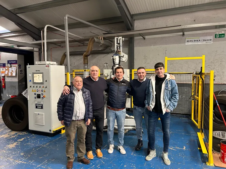
The Brazilian Retreader’s Association ABR has announced that it is changing its logo to coincide with the Association’s 35th anniversary.
Brazilian Association Adds New Logo
ABR’s current branding was created 10 years ago, when the association celebrated its 25th anniversary, and it was a reinterpretation of the first logo of 1985. However, ABR has now decided to go further and give a completely new face to the Association.
“The objective of changing the branding that has represented the Association for so many years, had the main goal of repositioning the entity in relation to its main roles of promoting sustainability and defending the sector”, said Everson Schmidt, ABR’s Communications Director.
According to L. Gustavo Moser from design agency VoxCom, the concept of the logo primarily took into account the issue of sustainability provided by the retreading process. “The idea for this redesign was to convey what ABR really represents: renovation. For this reason, the sustainable tyre cycle icon was incorporated, integrated with solid typography and contemporary colours, reinforcing the green that, again, refers to environmental sustainability.”
Another issue taken into consideration for the creation of the new logo was the digital application that requires simpler images, with less detail, ensuring correct execution in different media ranging from a screen to a smart watch, tablet or cell phone.
Finally, the new logo removed the word “segment” from the brand signature, so that the phrase REFORMA DE PNEUS could gain more prominence, helping the association to be identified more quickly and simply.